Anyway, lots of good advice on doing a big time looking movie on the cheap (El Mariachi style, less then $7000). The main point being Hollywood has $$$, you have time. Make your movie in storyboard first (where have I heard that before?) and then shoot your boards, that way you don't have to worry about coverage you shoot what you need and use slight of hand cuts to give the feeling you want without blowing borrowed sets up. Think light and agile (ie need an accident scene, keep your camera in the back of your car and stalk the fire stations training grounds) and know your going to be doing a ton in post to make it look pro (comp in bg's you couldn't get permission to shoot, comp in explosions and gunfire you can't afford to do). So had good technical stuff on getting a solid professional look out of images (which is applicable to stop mo or post on animated films as well as live action.) So I'd recommend it if you want to do a live action film, or even if you want to help on the post of an animated one.
Aspect Ratio:
action flicks are always widescreen. Academy=4:3=grandma, no one uses it anymore. Standard widescreen is 1.85:1 (aka one-eight-five) Video you can crop down/mask to 16:9 which is almost identical to 1.85:1 so 16:9 is default for DV Rebels
SuperWide Screen:2.40:1 (star wars, La femme nikita) image squeezed when recorded stretched (cinema"scoped") when projected. Which gives that Bladerunner long horizontal blue lens flare (instead of a round one)

Lenses:
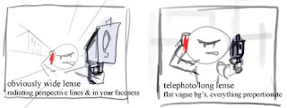
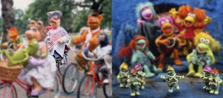
Lenses are the palette of your film language. Wide angle is typical of action flicks (gives you that "in your face" feel), fish eye barrel distortion gives away you're using DV, AfterEffects optics compensation removes it. You can even draw your storyboards to suggest what kind of lense to use (as my quick copy of his quick example shows) 35mm film does shallow depth of field, if you can get that it makes your stuff look quality. DoF is usefull because you really control focus composition and detail. (So with lenses and depth of field not only do you get the film look, but you also simplify your compositions to the level of comic books, like Jeff Smith's Bone, if the point of a 2 shot is the dialogue, you can use dof to make the bg abstract and equivalent to leaving it out like you would in a comic book.See my way heavy handed example using the Muppets to illustrate how you focus the eye and make the rest irrelevant)

Directing Actors by Judith Weston
look for triangular compositions & rule of thirds yatta yatta
what does the camera tell us in every scene? a low angle shot of a swat team busting in will make the team feel powerful, a down angle shot from above of them bursting in will make us feel like someone's gonna get the drop on them. p. 226 has a great example of asking and answering questions (each shot should answer the ? from the previous shot, and ask a new ?) his example: Dude looks through a sniper scope (what's he see?), POV guy sitting in a car (what's our dude think?), Close Up face with scope: he looks serious (will he do it?), shot of hand on trigger he's about to but stops (why?) full body shot: our guy looking over his shoulder (what's he see?) car pulling up beside his (who's that?) close up driver: its competing assassin with gun drawn(!!!) etc.
22fps is the conventional wisdom for speeding things up for a little extra oomph, slower and what's the point, faster and it's obvious. (undercranking=recording at a slower pace then playback will be)
if you want to shoot a scene outdoors, find it on google maps, and input the gps coordinates from google maps into sketchup, then sketchup can tell you where the sun's going to be all day long, so you can plan your shooting schedule based on where you want the sun to be.
best way to make a special effects shot feel real is to film it as if it where real. If filming miniatures make sure the camera is moving at a proportionate speed. If you're cg blowing up a car track the camera like a real camera man would (trying to keep the car in screen but not being dead perfect), basically make the camera feel like it's in a real place with real weight and speed, as if you were there, even if it's 100% inside the computer.
HDR (High Dynamic Range Lighting)taking several exposures of the same scene, so when they're all blended together you get impossible to photograph photos, like a night city scene where you can see all the details under the streetlights, but also see the full milky way. So you use a mirror ball to get a snapshot of the whole world around, and you project it onto a sky map to mimic the light of the environment. (so I'm a noob for not knowing this stuff, so what, it's my blog :P )
stock.xchng is online stock photo service that's mostly free, great place for bg matte photos. Or Vue series for making cg worlds, or Terragen which is the same but free.
p 219 Imagine a scene in where a man explains to a woman that she may never see her son again. Imagine the backstory of the imaginary viewer who's pov you want the audience to take. Someone who knows the women well, will only occassionally glance at the man, the man's not important the audience cares what how their friend takes this news. But if the audience knows the man better, maybe he's an FBI agent and this is his first time telling someone their son is dead, the viewer will want to see how he delivers the news. By how you cut the scene, you tell the audience which of these two options they are. You change the virtual personality fo the audience by dictating what's interesting to them, since we all naturally look at what's interesting to us, as the editor you are only allowing them to look where you tell them it's interesting, it's like you're controlling their minds. If you are constantly failing to show the audience what they truly want to see, they will become impatient and lose interest. Like a horror film where someone's wandered if, it might delight the viewer not to show them what's behind the actor, or it might annoy them, delicate line to walk.
8 frames on either end of a shot is a common "handle" for editors to have space to cut in where they want, but 10 and 12 is not unheard of.
three dominant tones is the average choice for color correctionists. Simple statements. Often shadows are pushed one way (like indigo), midtones another(like green), and highlights a third (like golden). Freeze frame any shot from your favorite movie "and count how many colors you see. Chances are there will be no more then three. ... You might find a scene with up to 4 dominant tones, and you will certainly find some with only one or two, but three is the average. Art directors, cinematographers, wardrobe artists, and directors consipire to restrict the palette of a movie" Then he talks about associating color with meaning (ie. red for scenes where the character makes choices not true to himself, yellow for the antagonist). Suddenly the purpose of those pixar color scripts becomes more clear to me. His examples are of the Matrix being green tinged and the real world being blueish. The Birds having a red object in a cool scene right before an attack. And American Beuaty having a red white and blue theme to all the major shots.
DeGraeve.com's color palette tool will take any web image you put in and spit out a palette of the strongest colors. A tool you can use to see if your composition is color harmonious, or to help you decide what kind of color harmony you should push too. Petr Stanecick color scheme designer has a tool that will automatically generate color palette's based off a color you choose and what kind of scheme you want (ie. analogous, split complimentary etc.)
some advice he has for color correction/altering, is that you can push colors super aggressively and the audience will go along with it if you keep flesh tones believable. Like Underworld being so blue and black and white, the flesh still looks like flesh. You can get away with warming up the flesh a little during your changes. One option is to throw a warm light onto your actor if you know you're going to smash the color balance to blue in post, so planning ahead for your final look.
One last piece of advice: you'll learn more from making a movie then from reading a book about making movies.

No comments:
Post a Comment