Just to gather my thoughts on family and features, cuz I've tracked these parts down multiple times:
Brandon Beckstead who's awesome came across a similar bump(bittersweet), he graduated from AM and got job offers from Dreamworks & Sony. "I realized that my dream job was more about my family than about my career." and he let the big fishes he had hooked go.
Then a year later "My family is in a much better situation to move this time and I just wanted to test the waters and ended up with a job at Dreamworks!"
"This is my first foray into feature film animation and it's even better than I thought it would be!"
and then another year and it looks like he's returned to games. I plan on dropping him an email when I get a chance
*he replied to my email Dreamworks was great, not crazy hours and felt stable for supporting a family but LA was terrible, traffic landlocked all the time, lot more money, just not a good situation for his family everyone was miserable so he left (and you have to respect someone who cares so much for his family)
I had dropped Victor Navone an email about balancing family and work and he came back that he usually works 9-5:30 but he's been at Pixar forever so is fast and has proven himself.
Also asked Jean Denis Haas about it, he said he does "9-6 when he can", and he also has been in the biz for a long while now. Later he wrote that he puts 200%effort in during the 9 hours a day he's at work, then zips home.
An old post by Ken Music says the schedule at Tippet was 9-7 with an hour and a half off.
Cameron Fielding came from games to ILM but was only offered a 2 month contract, which could have really screwed things up for him (fortunately he hooked up with dreamworks) short term project hire seems really hard for families.
I had asked Shawn Kelly about animators as migrant workers and he said: "
It's very common in the industry right now to offer "project positions," which end after the project ends. Often, these can evolve into full-time staff positions, but more often than not, the end when the contract was scheduled to end.
*7-19-11 got a reply from Beckstead
Tuesday, June 28, 2011
Brothers Quay
The Brothers Quay are the originals, long before Shane Acker ripped them off in CG or even before Adam Jones made those Tool videos the Quay Brothers invented the genre. Notoriously recluse unfortunately maintains their obscurity.
Anyway, looks like they have a new flick coming.
don't know how long these'll last, but here's their most well known head trip: Street of Crocodiles
*found here
Anyway, looks like they have a new flick coming.
don't know how long these'll last, but here's their most well known head trip: Street of Crocodiles
*found here
Monday, June 27, 2011
Tuesday, June 21, 2011
Monday, June 20, 2011
Tuesday, June 14, 2011
Annecy time again
Looks like the new batch from gobelins is out, not to into them lately, their motion is still gorgeous, but seem to be lacking solid stories that pull me in (maybe they're refinding their feet after Keith Lango has needled them about everything always being a running frantic thing) Anyway, this one I liked because I'm always a sucker for glowy lights.
Wolf Smoke outta China
Cartoon Brew found this small animation studio out of China
lot of fun action (bit over the top with the fan service, so be warned NSFW) subtitles under cc @ youtube
and a tv pilot thing they did
lot of fun action (bit over the top with the fan service, so be warned NSFW) subtitles under cc @ youtube
and a tv pilot thing they did
Thursday, June 2, 2011
Feng Zhu
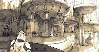
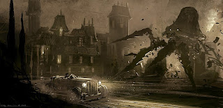
he has a really interesting trick (goes into it pretty quick on ep 5) where he's basically kit bashing his image value/color together. So he takes a bunch of random photos that have the feel he wants and just slaps them down onto a single layer, and I guess just color picks and colors in his line drawing. really interesting.
Holy Crap, Feng Zhu (who has always been awesome) has thrown down a billion tutorials (I think he has a school). He makes the brilliant point that watching a lot of tutorials is like watching a professional basketball player, it's cool to see, but you're not going to be able to go out and do it because you have to put in your practice time on the fundamentals which most tutorials don't even go over. Seems like maybe his earlier tut's (like this one) do go over the basics some.
he has a really interesting trick (he goes over it in ep 5) where he kit bashes random unrelated photos into 1 layer because it has the value and colors he wants. Then he color picks off that abstract image and fills in his line drawing. He does it again ep 14 part 2 @ 7:40 but this time he's laying down some techy photos as overlay, so they pick up the value of his painting but make his sketchy thing look totally teched out. (I think he takes all his own ref photos so that he doesn't have to worry about copywrite)
another thing he talks about is zooming out til your image is postage stamp size, the image will work if your values are well organized even this small, so don't get detaily until it works this way. Make sure the eye travels well around the image, and points to your emphasis.
he always throws down a horizon line, this tells him wether he's looking up or down onto parts (because our eyes are always on the horizon line) which helps with light and form.
know what the selling point of your image is and emphasize it
don't be afraid to use "entertainment lighting" meaning everything is awesomely lit with rim lights and stuff, because we're trying to make awesome images so do it
he always thinks in terms of forground mid and bg, usually pushes things back with fog layers to make them softer and less contrasty, repetition of objects helps us know distance by how small the further back one is, likes to include human sized elements so we can judge size,
he has a trick where he'll copy out a piece of the image, take it to a new file and uprez it to get details in (easier with a regular brush, instead of a 1 pixel brush) then drop it back in to the original and fit it in
for a painting he does a very loose line sketch, then fills it in with silhouette (or gradient w/ light at top) and starts working on defining form, as soon as he can turn off the lines and the forms and volumes still read he's done with the lines.
Wednesday, June 1, 2011
Less Talk more Rock
Bianca linked to this article about game design but applies to a lot of visual stuff.
Point 1.
1. Idea
2. Talk it out, look at it from every angle
3. Do it
but a whole lot of stuff dies at 2.
It's easy to pick things apart, harder to make art, just make it even if it's not perfect better to make then to just sit there tearing other stuff down. Find a way around 2 if you have to.
so...
1. Idea
2. DO IT
3. then talk about how to do it better next time.
Point 2.
Words are great, but they're coming into your brain through the narrow bandwidth of the intellect
Picture sound combo's flow into your whole brain easier and at a more base level.
Bianca Ansems
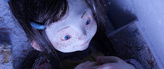
Ran across Bianca Ansems. Blog has some production stuff on it. Looks like grad student, had an internship at aardman maybe. Cool. (I hate having seeing a trailer then having to wait til it winds through the festival circuit to see it :( a well QQ)
Playing Ghost TRAILER from Bianca Ansems on Vimeo.
SHOWREEL 2011 Bianca Ansems from Bianca Ansems on Vimeo.
Kevin Dart & Joel Trussell
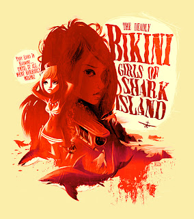
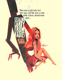
I saw Kevin Dart's stuff forever ago on the Drawingboard forums (which may be dead by hackers) had a cool retro look, then he did a little movie trailer in the style, and now has done an upgraded version.
A Kiss From Tokyo - HD from Yuki 7 on Vimeo.
Looks That Kill - HD from Yuki 7 on Vimeo.
Here's a promo by the Yuki 7's codirector Stephane Coedel
BBC OLYMPICS ©2008 Passion Pictures from Stephane coedel on Vimeo.
the stylized after effects look makes me think of Joel Trussell's (blog)stuff:
Morcheeba - Enjoy The Ride from Titus Curare on Vimeo.
all this stuff makes me think of how well you can tell a story even without fancy full animation. Like Grickle & Lou Romano & Will Finn, so make sure you know what you're goal is before you start, if it's just to tell a story consider what you can leave out and still get the idea across.
Subscribe to:
Comments (Atom)
