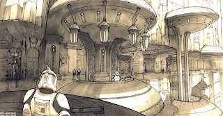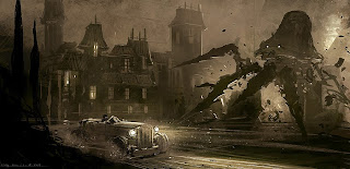

he has a really interesting trick (goes into it pretty quick on ep 5) where he's basically kit bashing his image value/color together. So he takes a bunch of random photos that have the feel he wants and just slaps them down onto a single layer, and I guess just color picks and colors in his line drawing. really interesting.
Holy Crap, Feng Zhu (who has always been awesome) has thrown down a billion tutorials (I think he has a school). He makes the brilliant point that watching a lot of tutorials is like watching a professional basketball player, it's cool to see, but you're not going to be able to go out and do it because you have to put in your practice time on the fundamentals which most tutorials don't even go over. Seems like maybe his earlier tut's (like this one) do go over the basics some.
he has a really interesting trick (he goes over it in ep 5) where he kit bashes random unrelated photos into 1 layer because it has the value and colors he wants. Then he color picks off that abstract image and fills in his line drawing. He does it again ep 14 part 2 @ 7:40 but this time he's laying down some techy photos as overlay, so they pick up the value of his painting but make his sketchy thing look totally teched out. (I think he takes all his own ref photos so that he doesn't have to worry about copywrite)
another thing he talks about is zooming out til your image is postage stamp size, the image will work if your values are well organized even this small, so don't get detaily until it works this way. Make sure the eye travels well around the image, and points to your emphasis.
he always throws down a horizon line, this tells him wether he's looking up or down onto parts (because our eyes are always on the horizon line) which helps with light and form.
know what the selling point of your image is and emphasize it
don't be afraid to use "entertainment lighting" meaning everything is awesomely lit with rim lights and stuff, because we're trying to make awesome images so do it
he always thinks in terms of forground mid and bg, usually pushes things back with fog layers to make them softer and less contrasty, repetition of objects helps us know distance by how small the further back one is, likes to include human sized elements so we can judge size,
he has a trick where he'll copy out a piece of the image, take it to a new file and uprez it to get details in (easier with a regular brush, instead of a 1 pixel brush) then drop it back in to the original and fit it in
for a painting he does a very loose line sketch, then fills it in with silhouette (or gradient w/ light at top) and starts working on defining form, as soon as he can turn off the lines and the forms and volumes still read he's done with the lines.

No comments:
Post a Comment